AJ Bell · Website redesign & design system · 2026 · 3 min read
AJ Bell
A public website rebuilt on one tokenised design system, with the primary button colour settled by a 200-person test instead of a meeting.
The situation
AJ Bell is one of the UK's largest investment platforms. Its public website had grown page by page: components varied from one section to the next, colour was applied by eye, and developers had no single source of truth to build from.
The people using it are choosing where to put an ISA or a pension. Heatmaps and user journeys showed where they hesitated, missed the main action or dropped out. The goal was a site that made the next step obvious on every page, without losing the brand people already trusted.
My part
I was one of two designers on the redesign for six months, in a team with a product manager and four developers. I ran the heatmap and journey review, reworked the information architecture, built the colour system, tokens and component library, designed the homepage for desktop, tablet and mobile, and wrote the developer cheatsheet.
The four developers built the components and pages. The other designer and I ran the button colour test together. Iconography and photography came from third-party agencies, which I directed so their work fitted the new system.
Key decisions
- 01
Settle the button colour with a test, not an opinion
Three colours were in play for primary actions: Primary Red, a darker Mud Red and Black Zinc. Rather than pick one in a review, the other designer and I tested them with 200 participants on hero banners, cards and content pages, using 5-second, comprehension, salience and primary-action tests. Primary Red won in every context, so it stayed.
Principle 02 · Test before build
- 02
Build the system before the pages
The old site had grown one page at a time, which is how it became inconsistent. I built the colour system, tokens and components first, tested card and hero layouts as explorations, and only then assembled the homepage from those parts. The alternative, redesigning page by page, would have repeated the original problem.
Principle 04 · Write the rules down
- 03
Stay until the live site matches the file
Handoff was not the end. I wrote a cheatsheet covering tokens, spacing and components, then worked with the developers through implementation, checking components and API-driven content against the design. The slider below compares the Figma file with ajbell.co.uk as it runs today.
Principle 03 · What ships is what was designed
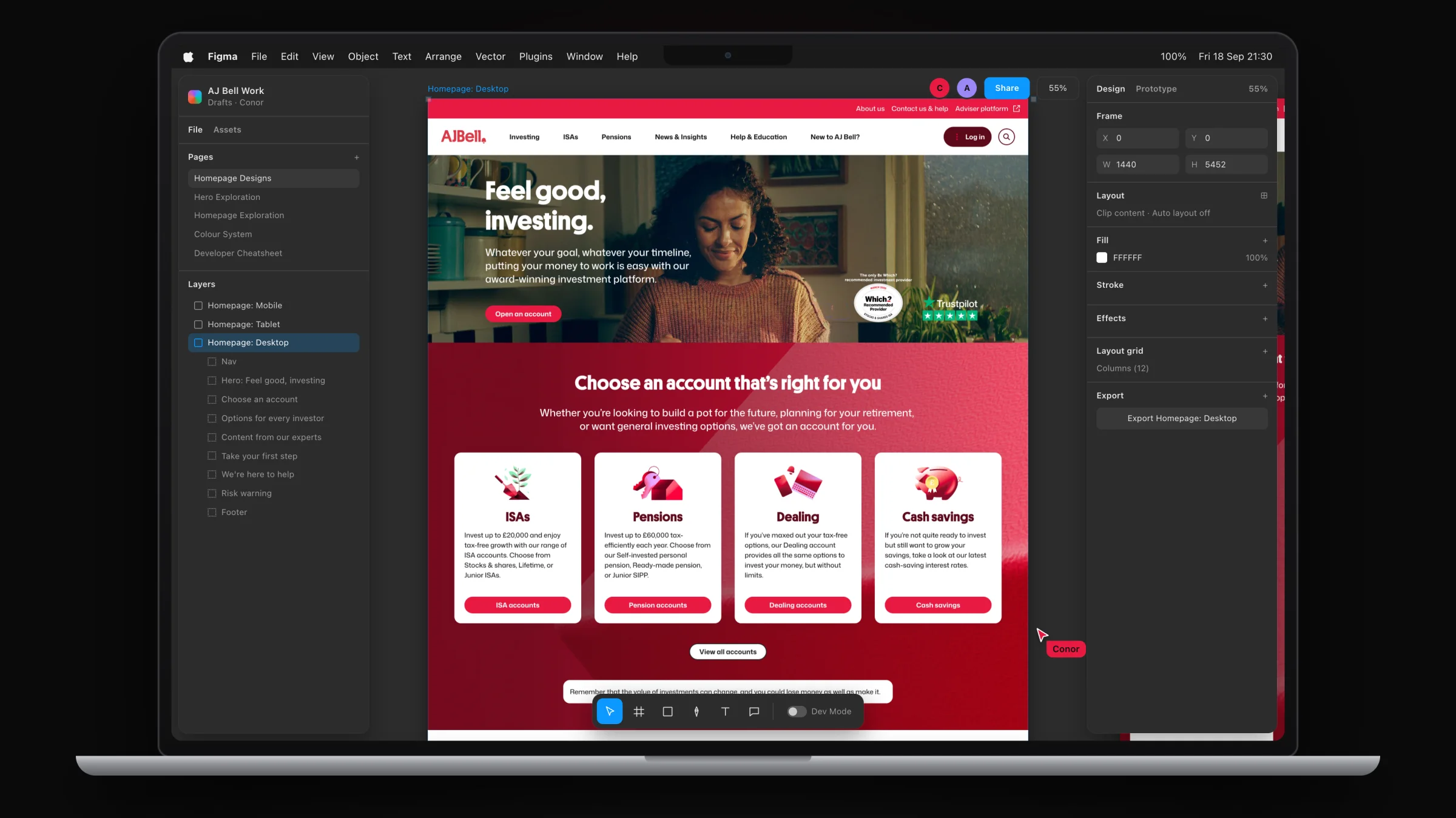
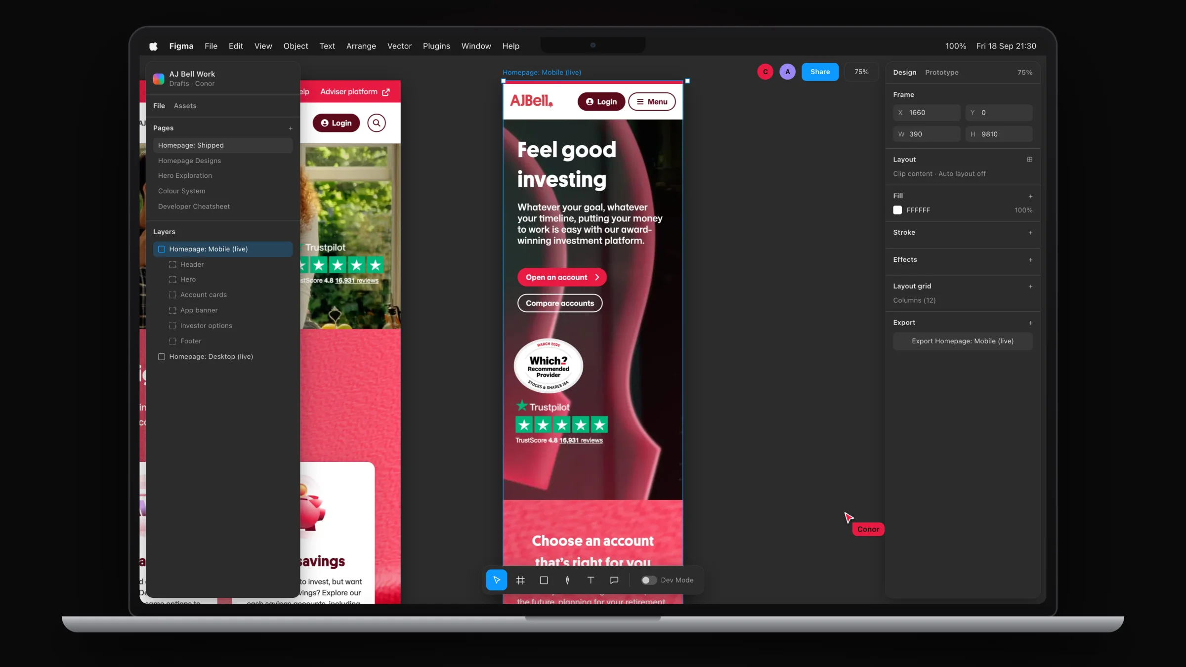
Homepage · Figma
One homepage, every screen
The hi-fi homepage designed in Figma for desktop, tablet and mobile, built from the new components, colour system and tokens, and handed off to developers.
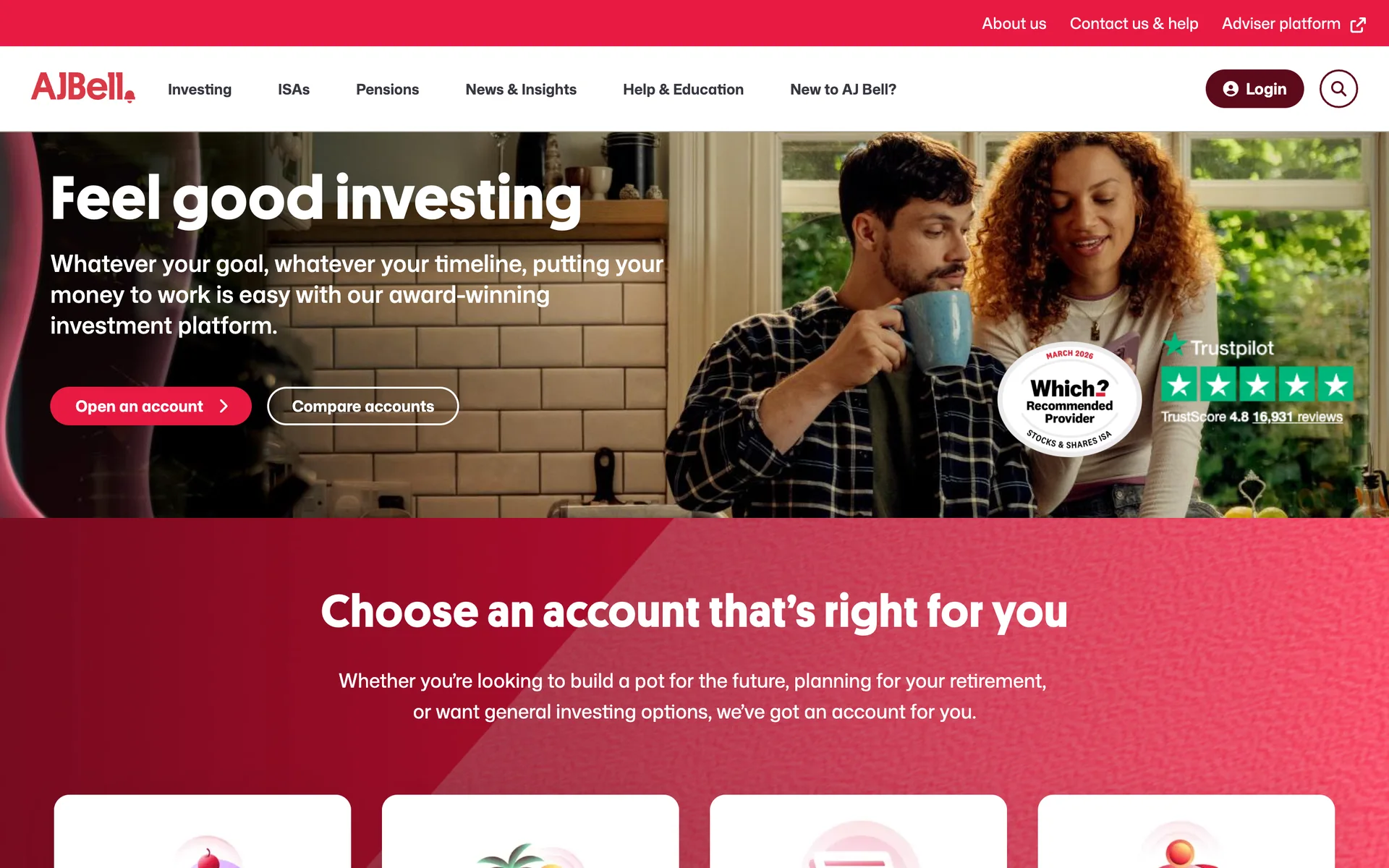
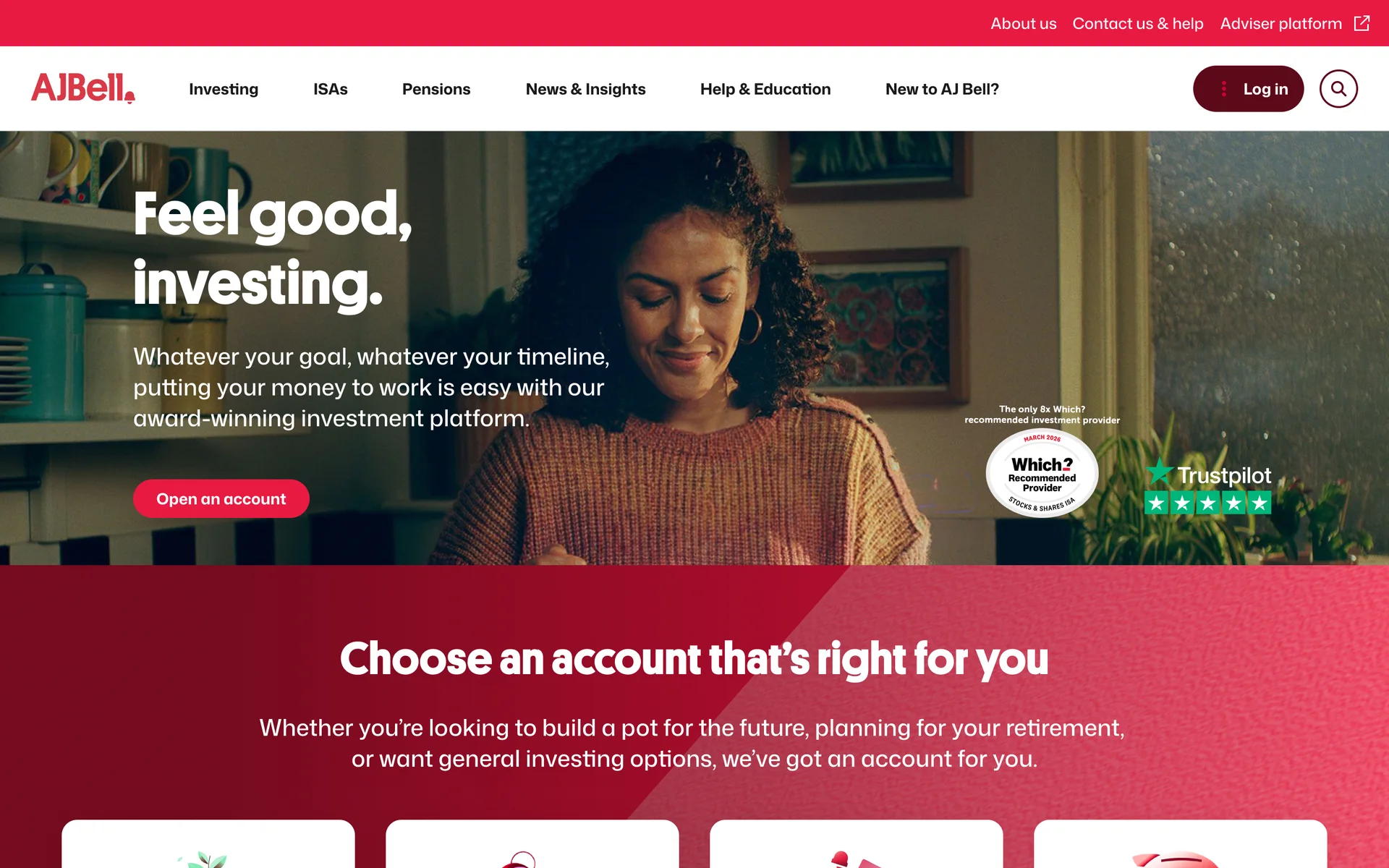
Shipped · ajbell.co.uk
The live homepage
The homepage as it runs today on ajbell.co.uk, on desktop and mobile.
Working with the team
Three groups had to agree for this to ship: AJ Bell's stakeholders, their developers and the outside agencies. On colour, the test results made the case, because the numbers read the same to everyone.
With the agencies, I briefed iconography and photography against the new brand system and reviewed their output against it. With developers, the cheatsheet answered the routine questions so our time together went on the edge cases.
What I’d do next
Measure the live site, not only the prototype
The test shows which button people notice. It does not show whether more of them open an account. The next step is to track primary-action click-through on the new pages against the old ones.
Look harder at the 60%
Primary Red won clearly on heroes and cards, and less clearly inside long content. I would test those pages again with the button's position and surrounding copy as the variables, not its colour.
Results
The rebranded public website is live on desktop, tablet and mobile, built on one reusable component foundation. The colour palette meets WCAG 2.1 AA contrast across every component state and screen size.
- Participants in the button colour test
- 200
- Preferred Primary Red on hero banners
- 88%
- Preferred it on card layouts
- 76%
- WCAG 2.1 contrast on every component state
- AA
Test figures are from preference and recognition testing before build (5-second, comprehension, salience and primary-action tests). In content-heavy sections the preference was 60%. They measure what people noticed and chose, not conversion on the live site.