Horse & Country · Web, mobile & TV streaming apps · 2023–now · 3 min read
Horse & Country
One streaming product across six platforms. Engagement up 25%, retention up 20%, and 40% less development time because prototypes were tested before anything was built.
The situation
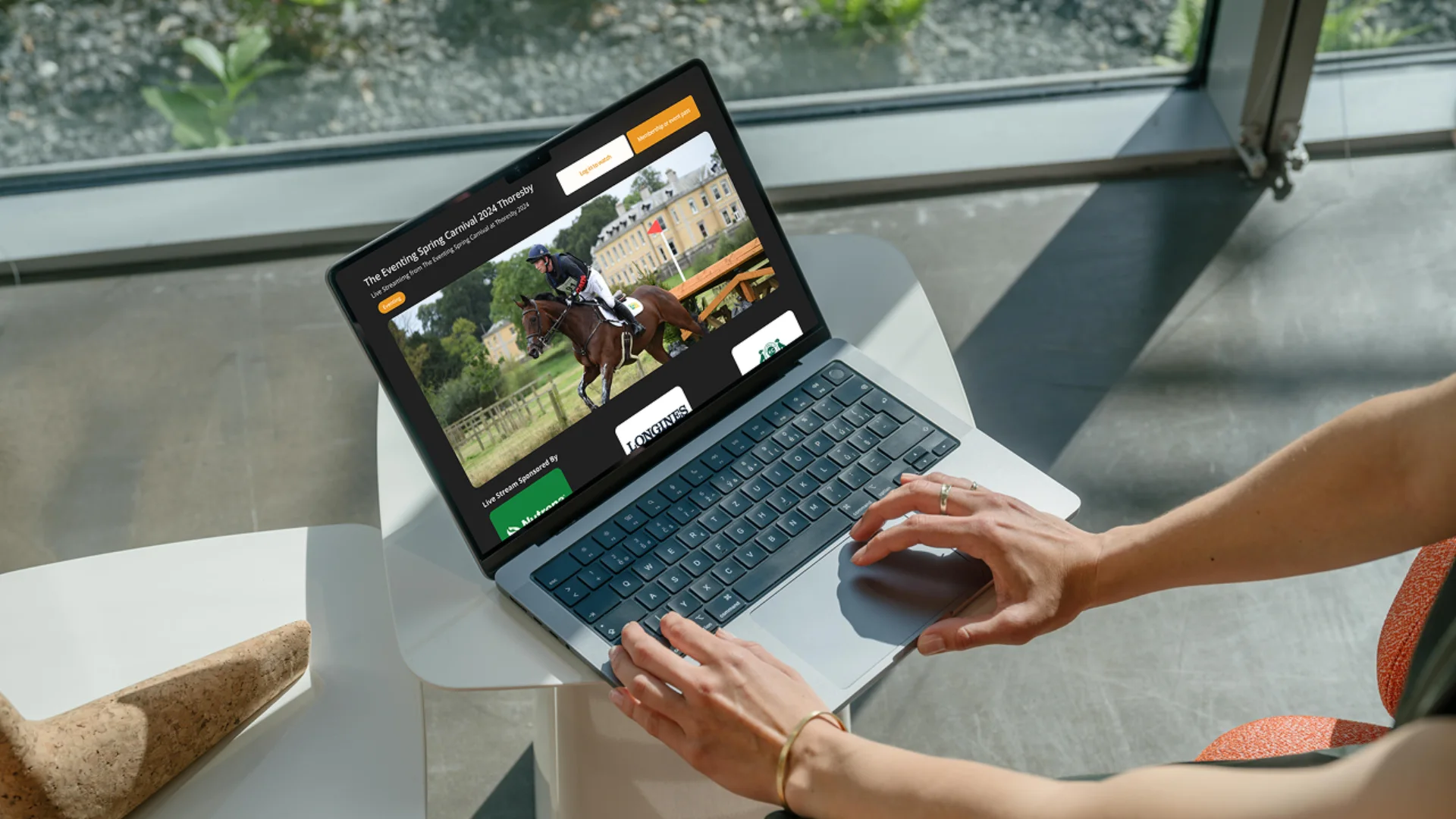
Horse & Country is an international equestrian streaming service: live sport, training and documentaries. Its website, mobile apps and TV apps were inconsistent with each other, and navigation made live events and on-demand shows hard to find.
Subscribers are riders and fans who come for live competition, training content and new episodes. The goal was to make that content easy to reach on any device, and to make six platforms feel like one product.
My part
I have been the UI designer on H&C since January 2023, on an ongoing retainer. I redesigned the core journeys with the CEO and the design team, designed the interfaces for all six platforms in Figma, built the ProtoPie prototypes and ran the user interviews and usability tests.
Two developers built the apps, with two project leads running delivery. Video, results and CMS came from third-party vendors, and I worked with them on how their data and feeds appear in the interface.

Key decisions
- 01
Lead every screen with what is live
The redesigned homepage opens on a live hero, then recent events, then originals. Event hubs put multi-arena streams and live results in one place, so nobody leaves the stream to find a score. Live sport is what H&C has that no one else does, so it gets the most space.
Principle 01 · Give the important thing weight
- 02
Prototype in ProtoPie and test before build
Static screens could not show how a remote, a thumb and a mouse each move through the same journey. I built high-fidelity ProtoPie prototypes and put them in front of users first. Across 30+ interviews and tests, the problems surfaced in the prototype, where they were cheap to fix.
Principle 02 · Test before build
- 03
One set of patterns, adapted for each device
Six separate designs would have recreated the inconsistency we were fixing. I kept one set of components and rules, then adapted layout and focus behaviour for each context: a TV ten feet away, a phone in one hand, a desktop browser.
Principle 04 · Write the rules down
Design process · Figma
Inside the H&C Designs file
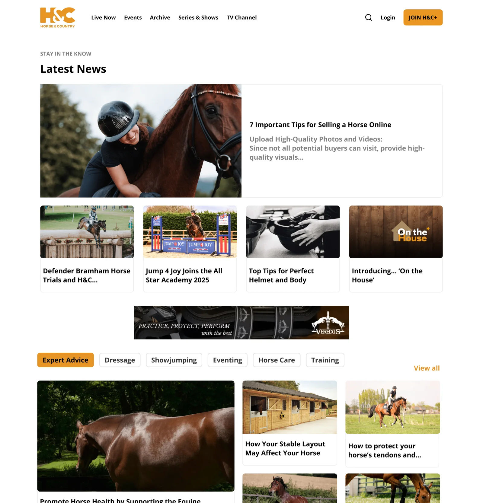
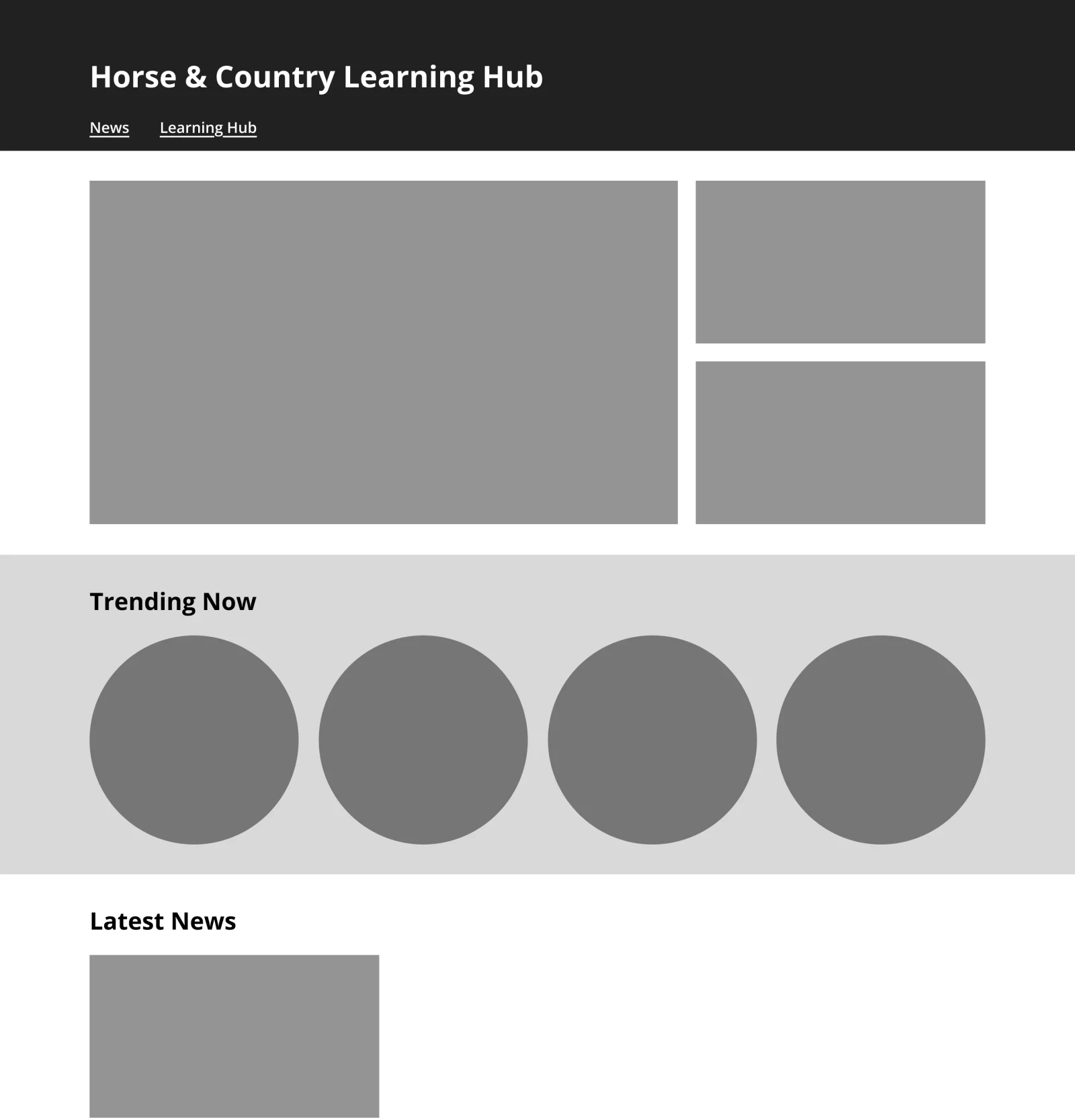
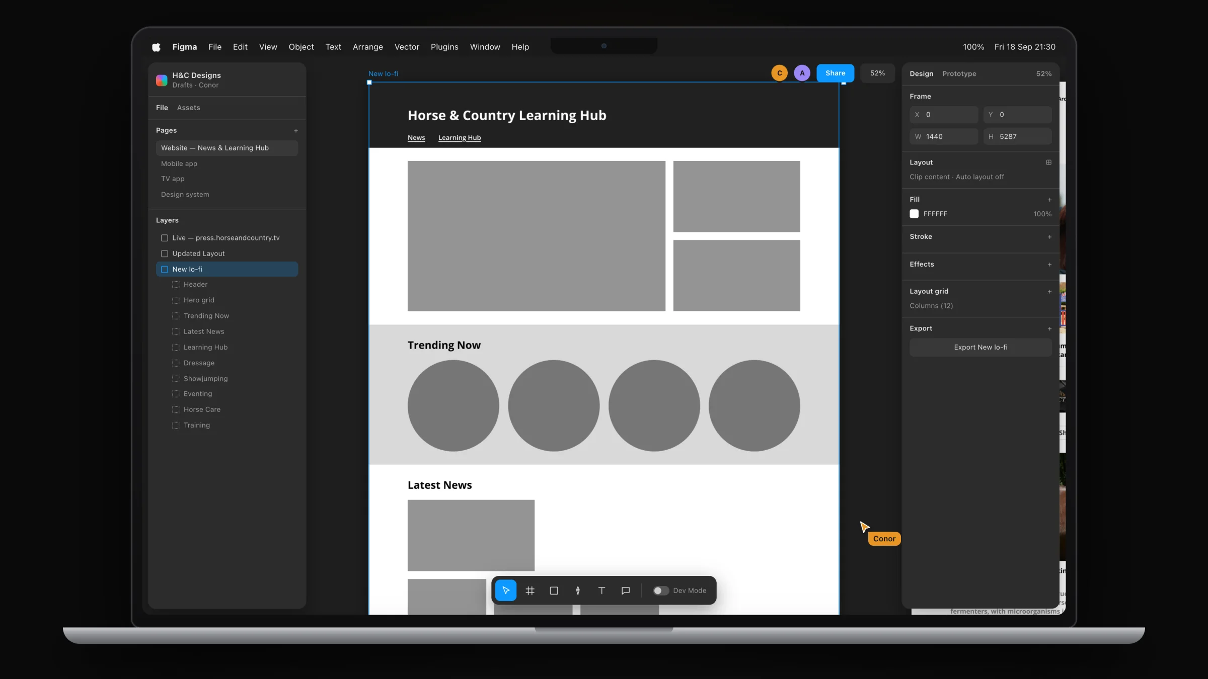
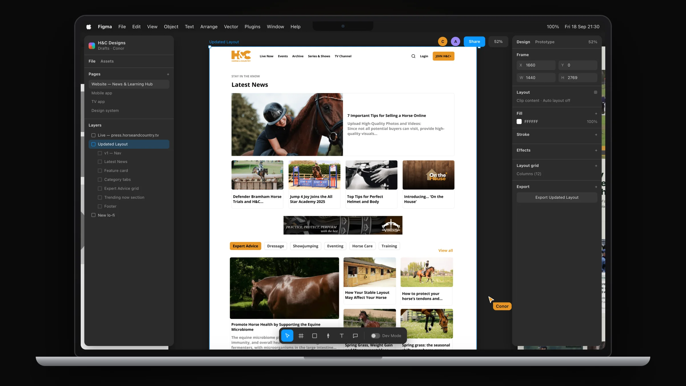
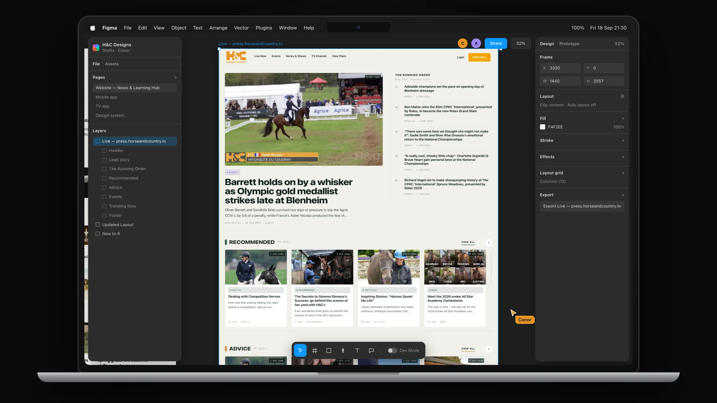
From grey-box wireframe to the live site: the Learning Hub and News pages, straight from the Figma file.
Streaming platform · Figma
Designing H&C+ for web & mobile
The subscription streaming platform (homepage, Series & Shows, live event hubs, clips and series pages), designed in Figma for desktop and mobile.
Working with the team
The core journeys were redesigned in working sessions with the CEO and the design team, so product decisions and design decisions were made in the same room. Findings from each round of testing went back to that group before the next round of design.
During build I worked with the developers and third-party vendors on APIs, data feeds and the CMS, and reviewed each release against the design.
He made an effort to understand the product and work with the development team to get the best user interactions and designs for the customer.
What I’d do next
Agree the measures before the redesign
The engagement and retention figures cover the redesign as a whole. Next time I would record a baseline for each journey before design starts, so every release can be credited with its own change.
Document the system from day one
The shared patterns lived mostly in the Figma file. I would write them up as tokens and a developer cheatsheet from the start, as I later did at AJ Bell, so the developers can move without waiting on me.
Results
The redesigned journeys shipped across iOS, Android, Apple TV, Fire TV, web and desktop, with the same components and navigation on each.
- More user engagement
- 25%
- Higher retention
- 20%
- Less development time
- 40%
- Interviews and usability tests
- 30+
Figures are for the streaming platform during my retainer, 2023 to now.